Design study
The visual identity of Piercarlo Carcereri
An essential, recognisable language that follows every bottle from the cellar to the table: the logo, the wine and olive oil labels, the website.
01 · Logo
A logo that is a signature
The logotype brings together two souls: the first name in calligraphic script, a personal gesture like a signature, and the surname in slender, composed capitals, as solid as the family tradition. Instinct and rigour, just like the wine.
- Classico
- L'Astrologo
- Oil
- Monochrome
01
Signature
The script recalls handwriting: every bottle carries the name of the person who made it.
02
Roots
The well-proportioned, unadorned capitals represent the family and a vineyard dating back to the early 1800s.
03
Versatility
Monochrome by nature, the logo changes colour with each product without losing its recognisability.
02 · Colours
Black and a single accent
All labels share a deep black background, a stage for one accent colour per product. The colour identifies the product at a glance; the black holds the family together.
Cellar black
#262626
Background of every label
Carcereri orange
#FF8441
Logo and Classico wine
Astrologo gold
#FFC51A
L'Astrologo accent
Olive green
#ACC270
Extra virgin olive oil accent
White
#FFFFFF
Names and information
Cream
#FFF7ED
Website background
03 · Wine
The wine labels
Every label follows the same grid: logo at the top, wine name in the centre, vintage and motto at the bottom between two thin rules. The front is essential, almost silent; the back neatly gathers all mandatory information.
Le verità
Idillico, luculliano e ammaliante
Idyllic, sumptuos and bewitching
Le verità
VENETO
Indicazione geografica tipica
BIANCO
2019
Vino non filtrato e ottenuto nella sua totalità da una fermentazione spontanea e naturale
Unfiltered wine obtained from a spontaneous and natural fermentation
Prodotto e imbottigliato da VR 4328 - IT
Per AZ. AGR. CARCERERI PIERCARLO
Colognola ai Colli - Italia
Prodotto in Italia
contiene solfiti|contains sulfites
750ml℮
12.5% vol
01
Consistent grid
Logo, name and vintage always sit in the same positions: the family is recognisable even on the shelf.
02
Bilingual
Motto and description are in Italian and English, designed for those who drink far from Veneto too.
03
Numbered bottles
The “Bottle no.” field on the back underlines the limited production of each vintage.
The collection
The same system gives rise to different labels: a small constellation of dots for Classico and L'Astrologo, and decorations hand-painted directly on the glass for large formats.
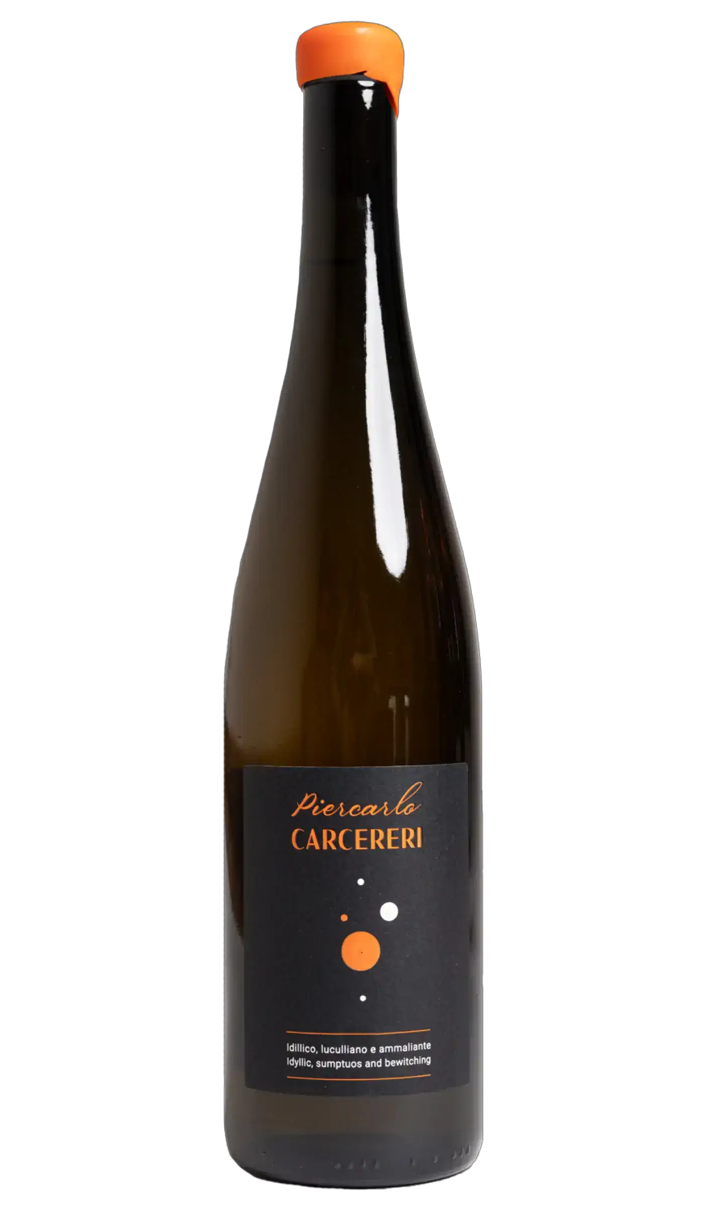
Classico IGT
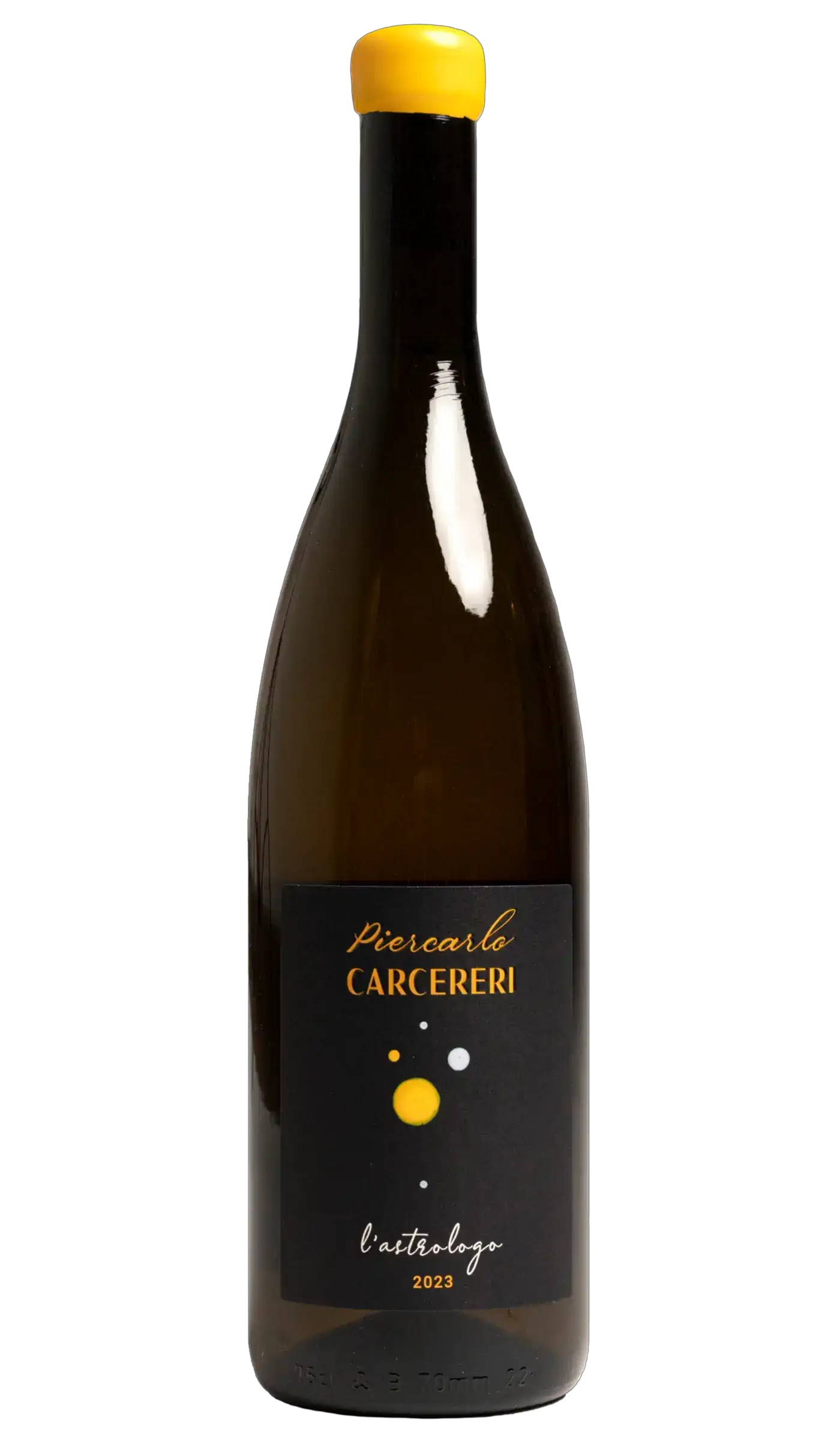
L'Astrologo
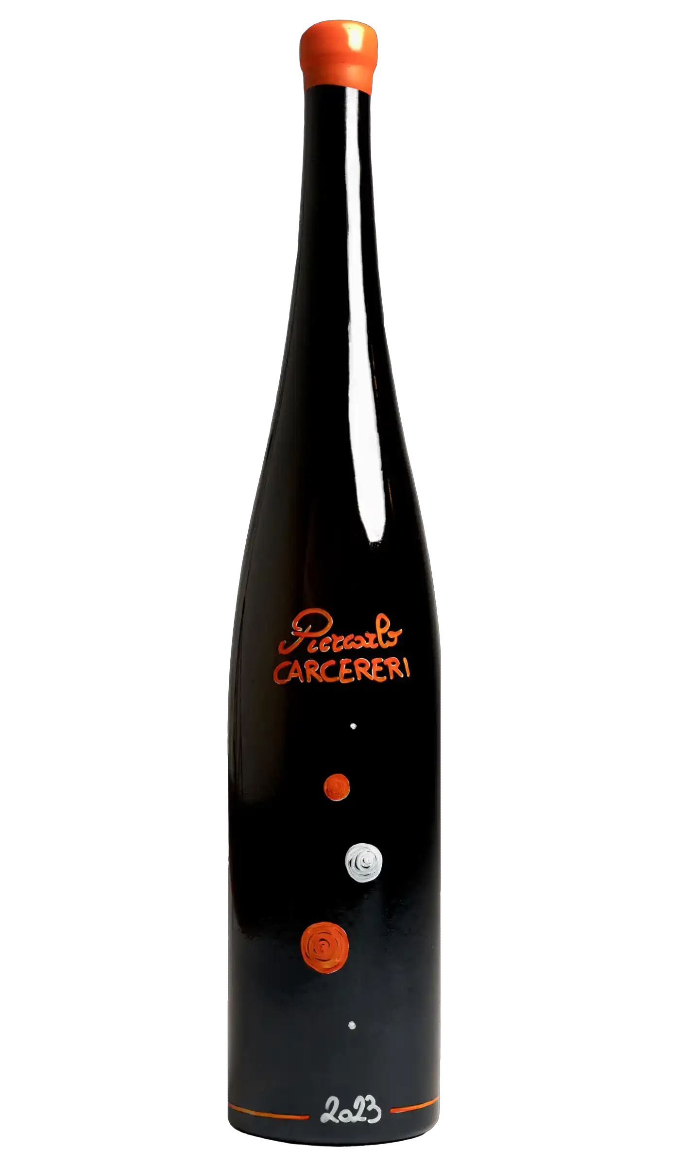
Hand-painted magnum
04 · Oil
The olive oil label
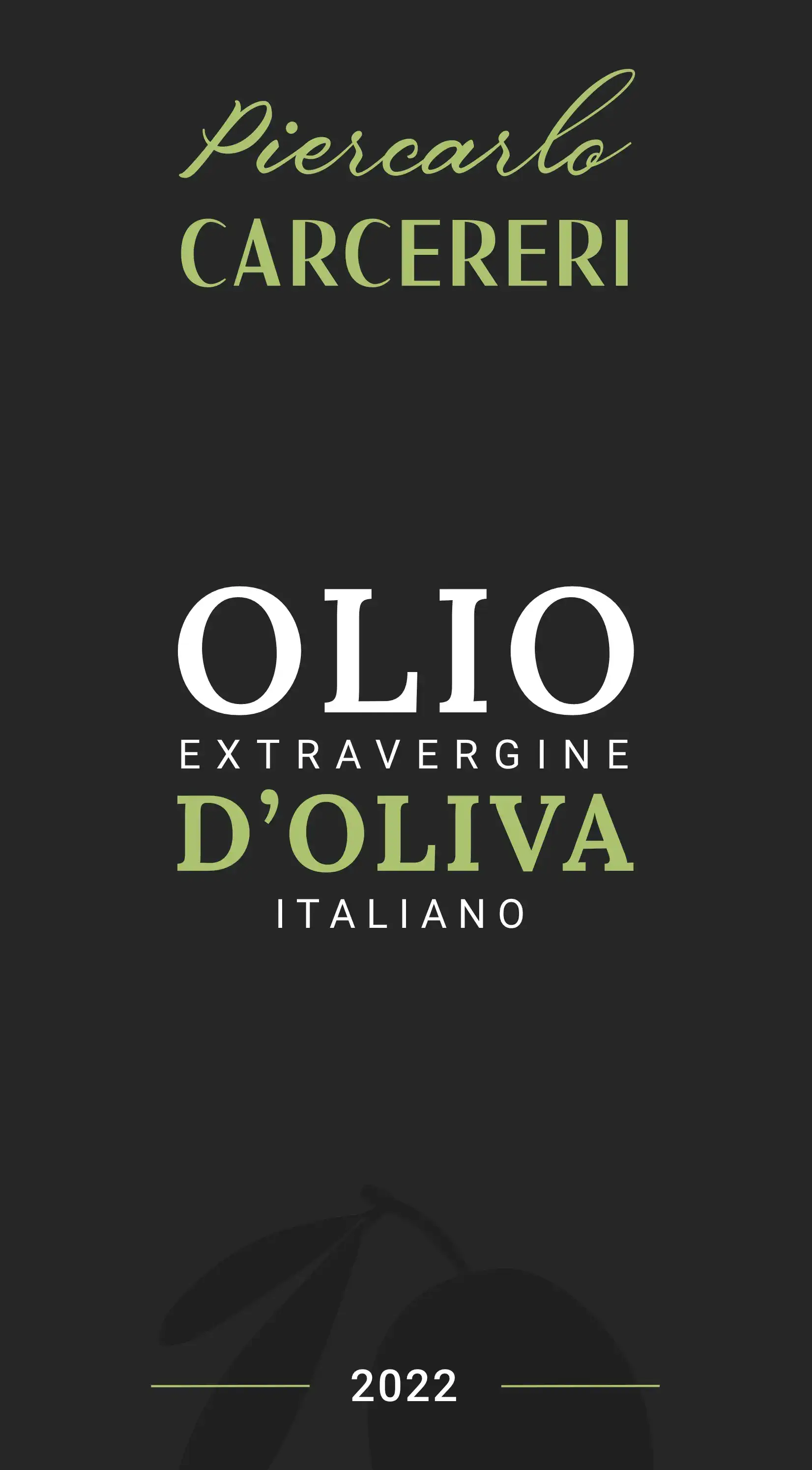
For the extra virgin olive oil the system stays the same, only the season changes: orange gives way to a soft olive green, and the silhouette of an olive branch barely emerges from the black background. The product name, in large serif letters, takes centre stage.
Bottiglia n°di 100 per
Ristorante Renato
Olio di oliva di categoria superiore, ottenuto direttamente dalle olive mediante procedimenti meccanici.
Per un'esperienza di gusto
onirica e autentica.
| Valori nutrizionali medi per | ml 100 |
| Energia | 3446 Kj 823.4 kcal |
| Proteine | 0 g |
| Carboidrati | 0 g |
| Grassi di cui acidi grassi saturi | 91.5 g 13.24 g |
| Sale | 0 g |
Campagna di raccolta 2022/2023
Da consumarsi preferibilmente entro il 31/12/2024
Conservare in luogo fresco e
lontano da fonti di luce o calore
Imbottigliato in Loc. Santa Giustina 10,
Illasi (VR), Italia
Per AZ. AGR. CARCERERI PIERCARLO
Colognola ai Colli - Italia
50 cl ℮
01
Clear hierarchy
OLIO and D'OLIVA stand out, EXTRAVERGINE and ITALIANO are letter-spaced: the name reads in an instant.
02
Dedicated editions
The back can be personalised with the restaurant's name and the bottle number, in a run of 100 pieces.
03
Information in order
Nutritional values, recycling and storage instructions are laid out in a clean, legible table.
05 · Website
The website
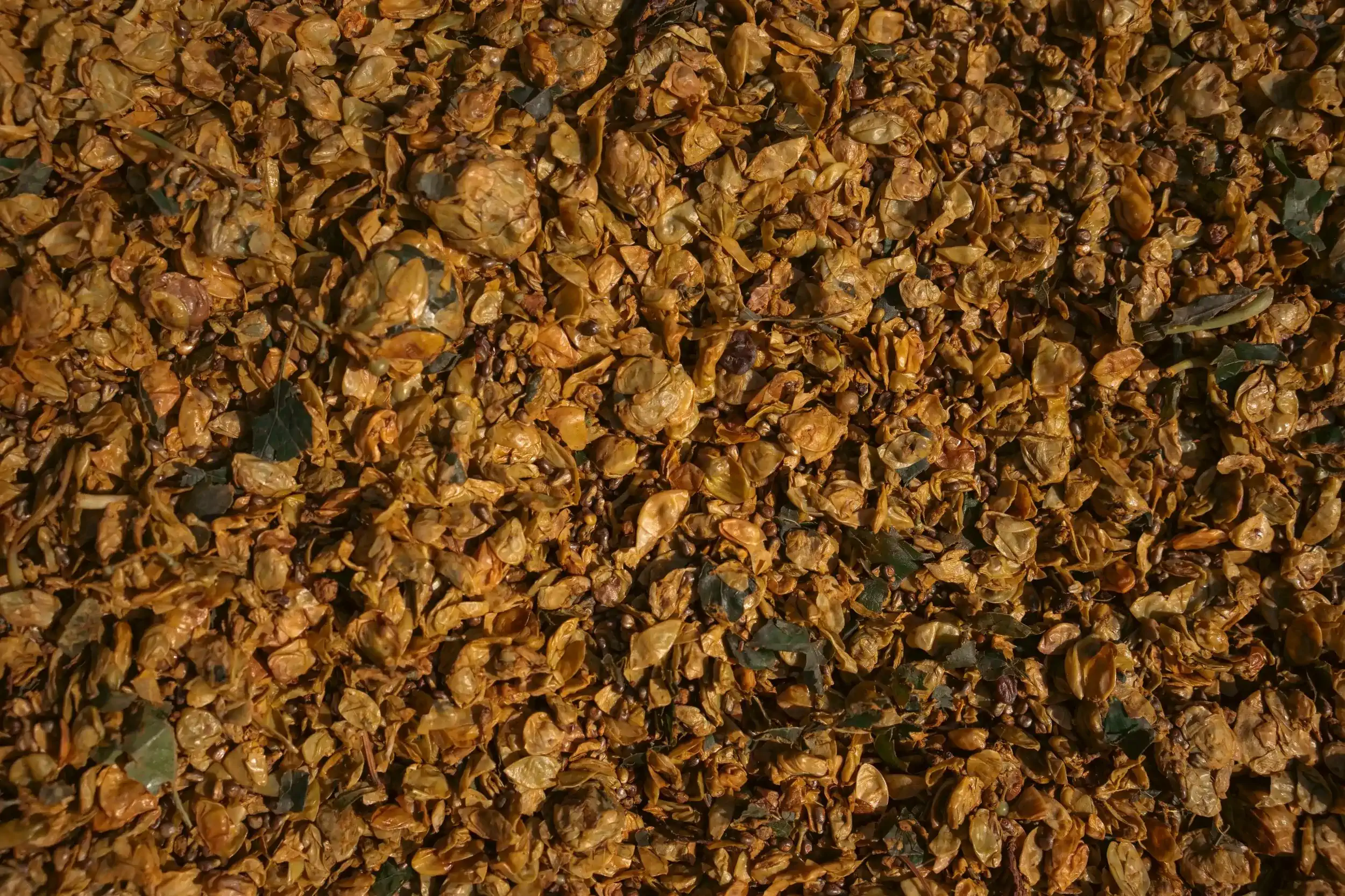
The website brings the atmosphere of the labels online: a warm cream background, cellar black and the orange of the logo. Photos of the vineyard and the hand-painted bottles run full width, while the texts tell Piercarlo's method and philosophy.
Seven languages
Italian, English, German, French, Spanish, Japanese and Chinese, with automatic language detection.
Fast and light
Static pages and optimised images for quick loading, even on mobile networks.
Designed for smartphones
Carousels, wine sheets and nutritional values are easy to browse on any device.
Website typefaces
Sora
Headings and interface
Aa
ABCDEFGHIJKLMNOPQRSTUVWXYZ
abcdefghijklmnopqrstuvwxyz 0123456789
Geist
Body text
Aa
ABCDEFGHIJKLMNOPQRSTUVWXYZ
abcdefghijklmnopqrstuvwxyz 0123456789